The ultimate guide to building your website’s homepage
Your website's homepage is your brand’s first impression. What is the impression you’re making? In this post we’re going to talk about:
Some basic website homepage terms
The general skeleton of a modern homepage
But first, why am I suggesting you limit your creative freedom and follow common guidelines? Why don’t I love your self-expression? First of all, you can do whatever you want, it’s your website! However, there are huge benefits to following a general structure.
According to a study by Microsoft, the average person has an attention span of 8 seconds — a sharp decrease from the average attention span of 12 seconds in 2000.
You have 8 seconds—maybe less—to convince your website visitor to keep scrolling. When you design your website within familiar parameters of what viewers are used to, their brain can focus on your content, rather than figuring out your layout.
Your website is a story. Your homepage is the back cover where someone gets a high-level understanding of your plot, tone, niche, and what they’ll get out of continuing to read.
Keep this in mind when you write your website homepage copy!
Basic SEO and digital marketing terms for your website’s homepage
Primary Navigation or Navigation bar
This bar is at the top of your webpage. It can be “static” or “fixed” or which means as someone scrolls down, the bar disappears. Or, it can “float” or be “sticky” which means as you scroll down the bar stays. Play with both examples for your website to figure out which works better for you. Keeping the bar makes it easier for people to click to the navigation at any time - which is helpful if your webpage is going to be long. However, that bar will take up visual retail space. If your webpage is going to be on the shorter side, let that bar hang up top so the rest of your homepage has center stage.
Static Navigation Bar (my site!)
<iframe src="https://giphy.com/embed/igt6hQGuS6nyqpH9Mt" width="480" height="242" frameBorder="0" class="giphy-embed" allowFullScreen></iframe><p><a href="https://giphy.com/gifs/igt6hQGuS6nyqpH9Mt">via GIPHY</a></p>
Floating Navigation Bar (example from Hinge University)
<iframe src="https://giphy.com/embed/RJDocyS18wdMRm6MiE" width="480" height="243" frameBorder="0" class="giphy-embed" allowFullScreen></iframe><p><a href="https://giphy.com/gifs/RJDocyS18wdMRm6MiE">via GIPHY</a></p>
Your primary navigation should make it easy for people to click to where they need to go. If you’re a lifestyle blog, you’ll want your blog categories in the navigation.
WATCH OUT FOR: If your website isn’t mobile responsive your navigation can start to run into your header logo or get funky. Make sure when you’re testing the UX of your website you play with how big your screen is to ensure that as you make your window smaller, the text doesn’t do anything weird.
Hero Section
Your hero section is the first area people see without needing to scroll. In this area you need to share:
Who you are
The value to your audience
CTA Button (Call to Action)
Now your hero second is going to look different depending on what industry you’re in. The above is a basic guideline.
If you have a lifestyle blog. Your “hero section” might often be image cards of the topics you write about. Here’s an example from my friend who writes on LiveLaughLeisure.com
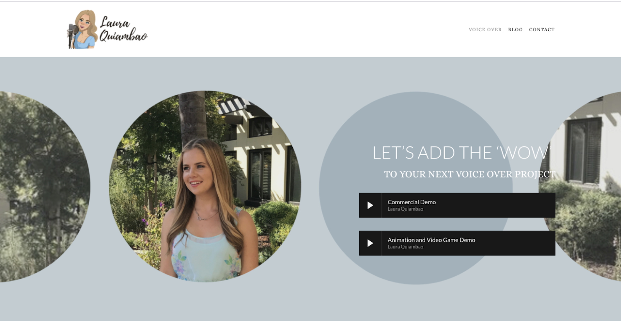
If you have a voice-over website. You’ll want your demo right in that hero section. You want to do this so that the second a potential client lands on your page, they can hear your voice right away. No clicking or scrolling required. That is unless voice-over is not your primary business i.e. if you’re a voice-over coach first, voice actor second.
If you’re a coach, business, brand, or offering a service. Take a note from HubSpot:
*Note: These next sections below can be in any order and are optional depending on your business.
External validation, work examples, or case studies
Depending on your business, this will look different. However, it’s extremely helpful to your audience to see external signs that you’re worth exploring further. (Ouch, harsh much, Laura? It’s a tough world out there dear reader.)
It’s helpful for your audience to connect with you on this level. You can add this to your website’s homepage in form of:
Videos or images of your work (i.e. if you’re a voice-over talent having video examples of your recent jobs)
Written reviews from clients (or, if you’re an author - highlighting reviews from publications)
A Logo bar of partners or clients you’ve worked
Image tiles of client case studies or testimonials
At least one other CTA or conversion opportunity mid-page
Most of the time, you’ll have a CTA (Call-to-action) in your primary navigation and in your hero section — like [Get a Demo] or [Contact Us] or [Work with Me]. It’s also important to have alternate forms of conversion on your page. One example could be a form where folks can subscribe to your newsletters. In a future blog, I’ll share how to layer conversion opportunities.
An ‘about you’ section — or sections
For a voice-over artist, actor, or coach. Take 3-10 sentences to share your experience and tools. This is where you want to clearly say what makes your voice, your talents, your services.
For brands and product services. This overarching section theme can be multiple sections. This is where you break down the different aspects of your service’s offerings. A lot of times you’ll see something like:
A contact form or CTA button
If someone got to the bottom of your page, tell them what to do next—contact you! Make the form as simple as possible with only key information you need. This way you won’t scare any prospective clients away by asking for too much information.
Give your homepage some love
Now that you have a structure, you’re ready for website copy! What other pieces of a homepage have you found helpful to add? Let me know in the comments below.


